Creating a New RDL
SQL Server Reporting Service (SSRS) require its reports to be generated in Report Definition Language (RDL). Package also contains a Visual Studio Environment to Develop RDLs, named Business Intelligent Studio.
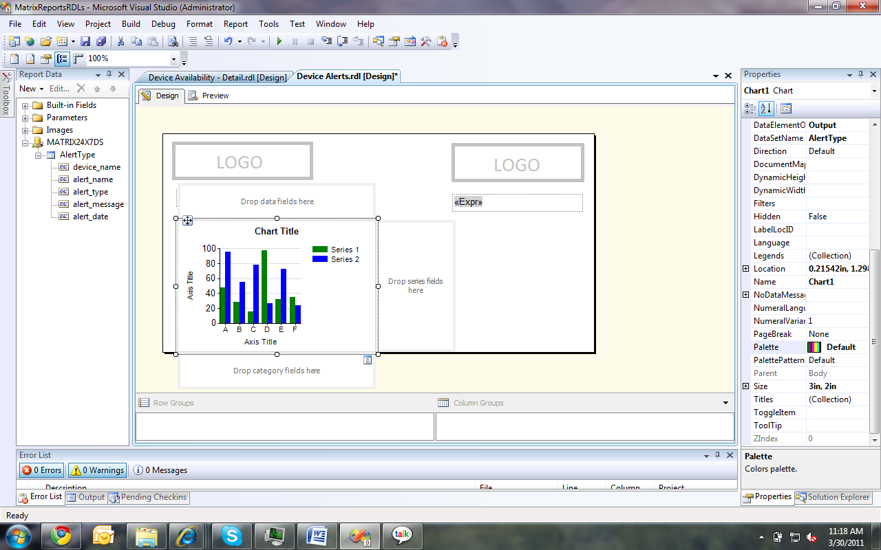
Shown below is a report in Business Intelligent Studio.

Visual area of the report is the canvas. All items on it will be shown in the final published report when viewed. tabular, matrix, charts, labels, images can be drag and dropped to the canvas from the Toolbox (shown vertically on the very left edge in the above image). once the report layout is created you can bind data to it. For any functional report there are few main parts to configure. They are,
- Data Source - which defines the connection string and the credentials to the database.
- Data Set – which defines the query to execute on the ‘Data Source’ to fetch data. ‘Fields’ are the returned data attributes for the Data Set.
- Parameters – these are user inputs that may required by the Data Set queries for the report.
- Chart, tabular, matrix, label items to be shown in the report.
Adding a New Report Item
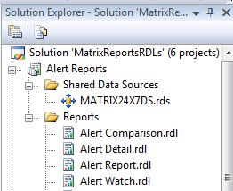
- Create a new Report Project.
- In the solution Explorer do the following changes.
- Add a shared data source to access the database.
- Right click on ‘Reports’ folder and add a new report Item.
- If ‘Report Data’ View is not visible in the workbench, go to ‘View’ menu and select ‘Report Data’.
Setting up Report Data Source and the Data Sets

- In the ‘Report Data’ select ‘New -> Data Source’ and point the new data source to the existing shared data source ‘MATRIX24X7DS’.
- In the same manner in ‘Report Data’ select ‘New -> Data Set’. In creation the ‘Data Set’ you have to specify the database stored procedure (sp) or the direct query relevant to this dataset.
Parameters for a Report
Parameters are the only method of getting user input for the report. When adding data set queries the user inputs required for the query to execute are automatically get added under ‘Parameters’ section. we can add new parameters, modify existing ones or even remove them as required.
- To add a new Parameter, in the ‘Report Data’ select ‘New –> Parameter’ and follow the wizard.
- To modify right click on an existing parameter and choose ‘Properties’
- To delete parameter right click and then select ‘Delete’
There are varies methods of taking user inputs using parameters.
- If required a date as a input in the wizard select type to be ‘Date’
- If you want the user to select from know list of values in the wizard add label-value pairs in the ‘Available Values’ section that will display a dropdown list in the runtime.
- If you want to set a default value to a parameter set it in the ‘Default Value’ section of the wizard.
- If you don’t want the user to see a parameter mark it as ‘Hidden’ in the wizard.
- If the data to available values should be obtain from the database select ‘By Query’ in the ‘Available Values’ section.
- If you want the user to provide no input select ‘Allow null’ option.
- If you want user to select more than one option from the all available values, select ‘Allow multiple inputs’.
- If you want parameters to show available values base on multiple values selected from a previous parameter by the user, set the dependent parameter ‘Available Values’ to previous parameter. set Label to ‘<prev_param>.label’ and Value to ‘<prev_param>.value’
Adding Charts
Column Chart
- Add a column chart from the toolbox, select chart type column and hit ‘Ok’.
- In chart properties set ‘DataSetName’
- Click inside the chart again. Something similar to above image should appear.
- Moving mouse over top right corner of all the 3 drop fields will make the selection button appear in blue as for the ‘Drop category field’ in the above image.
- In ‘Drop category fields’ click on the selection button and select the data field required for the x-Axis of the chart.
- In ‘Drop data fields’ click on the selection button and select the field that was selected for the category field. It will be shown as ‘Count(category_field)’.
- Double click on the ‘Chart Title’ and two ‘Axis Titles’, and give the relevant names for them.
- Drag and resize the chart as required.
- Go to the ‘Solution Explorer’ right click the report and select ‘Build’.
Bar Chart

Creating a bar chart is identical to column chart except the fact that chart type should be ‘Bar’ and hence will not be discuss again.
Pie Chart
Creating a pie chart is identical to column chart except the fact that chart type should be ‘Pie’ and hence will not be discuss again.
Line Chart

Creating a line chart is identical to column chart except the fact that chart type should be ‘Line’ and hence will not be discuss again.
Table

- Add a ‘Table’ instead of a chart to the canvas.
- Select the table and go to the property window of the table. Set the properties ‘DataSetName’.
- Type the column names in the header row.
- Select data set fields by clicking the top right corner blue icon and then the required field name in all the columns in the detail row.
- Leave the footer row empty or remove. It’s again a static row like the header row.
- Set borders, font style and cell background color by right clicking and selecting ‘Properties’ for cells.
Matrix Table

Matrix can be used populate dynamic columns when the creator has no prior knowledge on number of columns. To use this feature database query should result in the following format.
| Agent ID | Column Name | Column Value |
| A | Col_1 | Val_1 |
| A | Col_2 | Val_2 |
| A | Col_3 | Val_3 |
| B | Col_1 | Val_4 |
| B | Col_2 | Val_5 |
| B | Col_3 | Val_6 |
- Add a ‘Matrix’ from the toolbox to the canvas
- Set Matrix’s ‘DataSetName’ in the property plane.
- Insert a ‘Row Group’, and a ‘Column Group’ as followed
| Agent ID <- This is a text box | Col <- Column Name field |
| Id <- Agent ID field | Val <- Column Value field |
Now when this RDL is deployed and viewed, it will output a table as follows,
| Agent ID | Col_1 | Col_2 | Col_3 |
| A | Val_1 | Val_2 | Val_3 |
| B | Val_4 | Val_5 | Val_6 |
Multiple Series Charts

- Add any chart from the toolbox In the above case it’s a line chart.
- Set chart’s ‘DataSetName’ property.
- Select a x-axis field from ‘Drop category fields’ top right corner selection button.
- Select a group by field from ‘Drop series fields’ same as above.
- Select a data field from ‘Drop data fields’ same as above.
- Set x-axis title and y-axis title.
Very useful article...thanks....
ReplyDelete